
When we decided to reinvent how people discover and experience spices with Spice Sage, we knew our subscription service would be the heart of our business. But creating a seamless subscription experience that delights customers from sign-up to their 20th delivery isn’t straightforward—there are countless touchpoints, preferences, and potential roadblocks along the way.
That’s why we turned to user story mapping to visualize the entire journey and ensure we weren’t missing critical elements that would make or break the experience. I wanted to share our process because it transformed how we think about our product development at Spice Sage.
What Exactly Is User Story Mapping?
If you’re not familiar with user story mapping, think of it as creating a visual representation of your user’s journey through your product, organized by the steps they take and the tasks they need to accomplish. Unlike a flat backlog of features, a user story map maintains the context of how features fit into the user experience.
For our spice subscription service, this meant visualizing everything from a customer discovering our service to managing their preferences over time and eventually becoming a passionate advocate.
Setting the Stage: Our Mapping Workshop

We blocked out a full day for our initial mapping session and assembled our cross-functional team:
- Product managers
- UX designers
- Engineers
- Customer support representatives
- Marketing specialists
- Our spice sourcing expert (because product knowledge matters!)
The room was set up with large sheets of paper covering the walls, stacks of colorful sticky notes, and printouts of our user research findings for reference. We also had actual samples of our spice blends on the table to keep us connected to the physical product our digital experience would be supporting.
Step 1: Identifying Our User Personas

Before diving into the mapping, we aligned on who we were designing for. We focused on our two primary personas:
Curious Carla: A 32-year-old urban professional who enjoys hosting dinner parties, values authenticity, and is interested in exploring new flavors but has limited time for shopping.
Adventurous Alex: A 40-year-old parent who loves international cuisine, is health-conscious, and looks for ways to recreate travel experiences through cooking.
Having these personas visible throughout the session helped us stay focused on real user needs rather than our assumptions.
Step 2: Creating the Backbone

We started by identifying the major activities our users would engage in throughout their subscription journey. This formed the “backbone” of our map, running horizontally across the top:
- Discover & Research
- Sign Up & Customize
- Anticipate First Delivery
- Receive & Unbox
- Use Products
- Manage Subscription
- Share & Engage
- Renew & Grow
Each of these represented a significant phase of the customer journey. We deliberately kept this high-level to begin with, focusing on the user’s perspective rather than our system architecture.
Step 3: Breaking Down User Tasks

Under each major activity, we identified the specific tasks users would need to complete. For example, under “Sign Up & Customize,” we included:
- Compare subscription plans
- Select delivery frequency
- Indicate flavor preferences
- Specify dietary restrictions
- Enter shipping information
- Set up payment
- Review and confirm
This gave us a more detailed view of what users were trying to accomplish at each stage. We organized these vertically under each backbone activity, creating a structured grid of the full subscription experience.
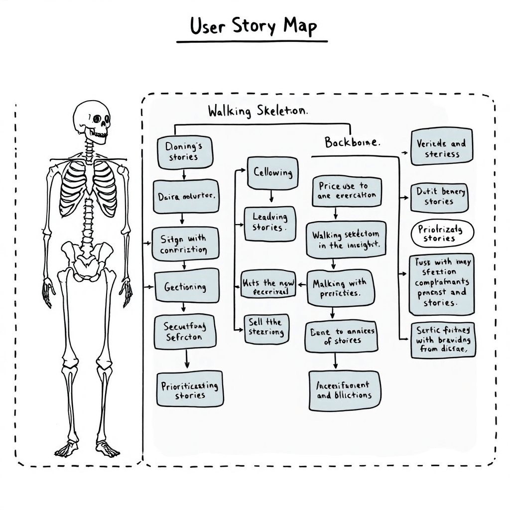
Step 4: Identifying the Walking Skeleton
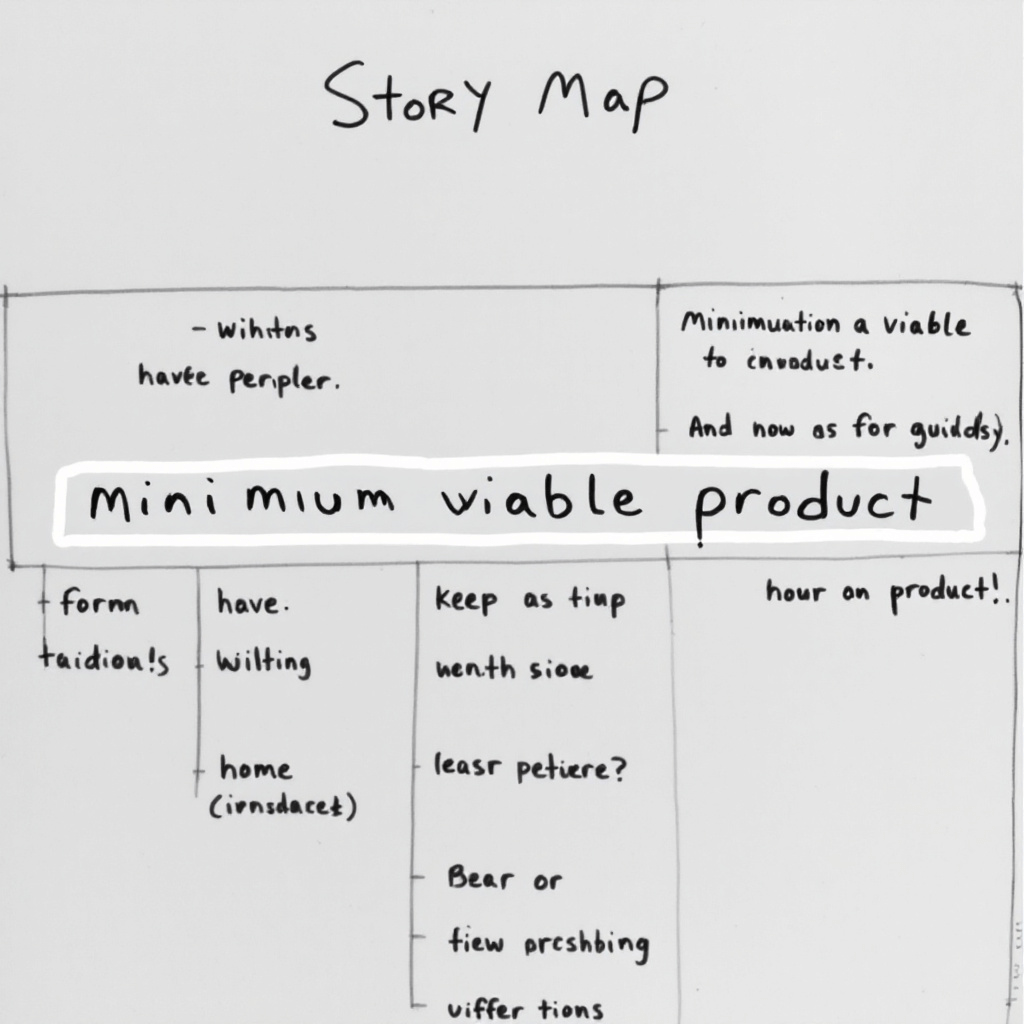
One of the most valuable parts of the mapping exercise was identifying our “walking skeleton”—the minimum set of features we needed to deliver a complete, end-to-end experience for our first release.
We drew a horizontal line across our map and placed the essential user stories above this line. This became our MVP (Minimum Viable Product) for the initial launch of Spice Sage subscriptions.
For example, while we had many ideas for customization options, for our walking skeleton we focused on just three essential preference selections:
- Heat level preference (mild to spicy)
- Cuisine type preference (e.g., Mediterranean, East Asian, Latin American)
- Dietary restrictions (common allergens)
More sophisticated preference options would come later, but these were enough to create a personalized experience from day one.
Step 5: Slicing into Releases

With our walking skeleton defined, we then organized the remaining stories into future releases. We drew additional horizontal lines to represent our release plan:
- Release 1: Essential subscription experience (3 months post-launch)
- Release 2: Enhanced personalization (6 months post-launch)
- Release 3: Community features and advanced recommendation engine (9 months post-launch)
This visualization helped everyone understand not just what we were building, but when different capabilities would be delivered. It also made it easier to have conversations about scope and priorities.
How the Map Changed Our Approach
The mapping process revealed several critical insights that changed our product design:
Insight 1: The Anticipation Gap
Our initial focus had been on the sign-up experience and the delivery experience, but the map highlighted a critical phase we’d overlooked: the time between signing up and receiving the first delivery. Users needed engagement during this “anticipation gap” to maintain excitement and set expectations.
This led us to create a series of pre-delivery emails introducing the spices that would be coming, their origins, and simple ways to use them—essentially priming customers for success with their first box.
Insight 2: The Education Need
The story mapping made it clear that “Use Products” wasn’t a simple, one-step activity. Many customers wouldn’t know how to use some of our more exotic spice blends effectively.
We realized we needed to create robust educational components:
- Recipe cards included with each delivery
- QR codes on packaging linking to video tutorials
- Integration with our mobile app for scanning spices to get usage suggestions
Insight 3: The Renewal Decision Point
The map highlighted that the renewal decision wasn’t a single moment but a culmination of experiences throughout the subscription. This shifted our thinking from treating renewals as a transactional feature to designing the entire experience with renewal in mind.
Turning the Map into Action
Once we completed our story map, we didn’t just file it away. We digitized it (using Miro) so remote team members could reference it, but we also kept a physical version visible in our main workspace.
The map became a powerful reference point for:
- Sprint planning sessions
- Design critiques
- Stakeholder discussions
- Onboarding new team members
When questions arose about why certain features were prioritized over others, we could refer back to the map to show how each piece fit into the overall user journey.
The Results: A Cohesive Subscription Experience
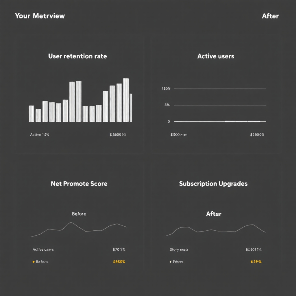
Six months after launching our subscription service based on this user story mapping approach, the results spoke for themselves:
- 92% retention rate after the first 3 months
- 78% of subscribers actively using the educational content
- NPS score of 82 (significantly above industry average)
- 68% of customers upgraded their subscription within the first year
Most importantly, we created a subscription experience that feels cohesive and thoughtful from the user’s perspective. By mapping the journey before building features, we ensured each touchpoint served a clear purpose in the overall experience.
Lessons for Your Own Story Mapping
If you’re considering using story mapping for your own product development, here are a few lessons we learned along the way:
- Involve diverse perspectives: Having team members from different functions caught blind spots we would have missed otherwise.
- Stay focused on user activities: It’s easy to slip into feature-thinking rather than activity-thinking. Keep asking “what is the user trying to accomplish?”
- Make it physical if possible: While digital tools are convenient, there’s something powerful about physically moving sticky notes around a wall that facilitates collaboration.
- Revisit and refine: Our map evolved over time as we learned from users. Treat it as a living document.
- Connect to metrics: For each major user activity, define what success looks like and how you’ll measure it.
For us at Spice Sage, user story mapping wasn’t just a planning exercise—it fundamentally changed how we think about our subscription experience. By visualizing the entire journey, we created a product that feels intentional at every step, which our customers notice and appreciate.
Have you used story mapping in your product development process? I’d love to hear about your experiences in the comments below!


Leave a comment